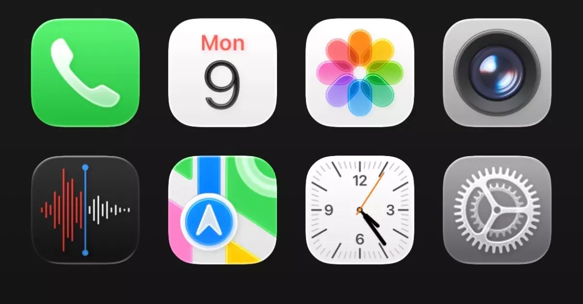
When Apple announced its latest design language, termed Liquid Glass, at WWDC 2025, the world took notice. This innovation promises to redefine how we interact with our devices by adding a visually captivating layer of translucency that fundamentally alters the perception of apps and content on the screen. While many enthusiasts celebrated this aesthetic shift as a bold move toward modernity, others—myself included—found themselves wrestling with a range of mixed feelings about this glossy overhaul.
The concept behind Liquid Glass aims to offer a more immersive experience, allowing elements like app icons and tab bars to appear as though they are gently floating above a user’s wallpaper and text. While this separator between the foreground and background is intended to add a touch of elegance, it does leave users wondering whether the visual complexity enriches functionality or just complicates it.
Aesthetics Over Clarity?
Upon first glance, the Liquid Glass interface delivers an undeniable ‘wow’ factor. The shiny, translucent app icons and tab bars evoke a sense of depth that many users may find visually exhilarating. However, the initial excitement quickly gave way to concerns about usability. With such a dramatic leap in style, the potential for cluttering the visual space became apparent, especially in user interfaces like the Control Center. Here, the charm of transparency struggles against the need for clarity. As visually appealing as it may be, the current iteration often jumbles essential functions, making it harder to locate important features at a glance.
A prime example of this is evident in the settings menu, which, instead of flowing seamlessly, feels disjointed with excessive spacing between categories. This slight inconsistency can lead to a frustrating experience for users expecting a polished and efficient interface, a hallmark of Apple’s design philosophy. The trust users place in Apple’s intuitive design is at stake when updates veer too far into the realm of opulence.
Detail or Distraction?
Delving deeper into Liquid Glass unveils minor details that exemplify Apple’s meticulous nature. The new tab animations, with buttons resembling droplets skimming across the surface, do lend an element of playfulness to the interaction. Yet, while such animations can enhance the experience, they risk becoming a distraction if they overshadow core functions. The experience ought to marry fluidity with practicality, and these new embellishments must support, rather than detract from, the user’s workflows.
One cannot ignore the adaptive features introduced in the iOS 26 developer beta. The keyboard, often mundane, receives a refreshing uplift. However, the duality of style and substance wrestles in various environments. In the Safari browser, where clarity is foundational, the bending URL bar can potentially lead to confusion as it shifts with the Liquid Glass backdrop. This brings to the forefront the question: Are these visually driven updates ultimately enhancing user experience, or are they merely superficial enhancements?
Growing Pains: The Inevitable Transition
Adapting to such a radical redesign takes time, and my initial aversion speaks volumes about our innate resistance to change. Historically, Apple has championed seamless transitions, but the leap into Liquid Glass feels more jarring than smooth. Once the novelty wears thin, users are left to grapple with functionality challenges. Critics, including myself, may initially lament this shift, but history reminds us that major updates often require a period of recalibration.
There’s room for growth, and I remain optimistic that Apple will refine the Liquid Glass interface before the official launch of iOS 26 this fall. History shows that feedback from developer betas often shapes the final product. It is this willingness to iterate that has solidified Apple’s reputation for quality – a beacon of hope as we navigate this change.
The ongoing evolution of Liquid Glass forces us to examine our relationship with technology. In elevating aesthetics, we must not lose sight of the core values that prioritize user experience. In the grand scheme, the challenge lies in balancing beauty with functionality, crafting an engaging digital landscape that uplifts our everyday interactions without sacrificing the clarity we depend on.

