
As smartphones evolve, they offer users increasingly sophisticated tools for personal expression and organization. Yet, when it comes to how we arrange our apps, many find themselves in a battle against the clutter of a basic grid layout. For years, the rows of app icons on our home screens have provided a familiar comfort, but they can also lead to an overwhelming sense of chaos. The allure of a neatly organized screen can give way to anxiety as the number of apps swells into the dozens. For many users, the traditional grid setup becomes less a tool of convenience and more a source of distraction.
Reflecting on my own experience with smartphone organization, I’ve recognized a distinct shift in my preferences. The advent of iOS updates such as 14 and now 18 has introduced innovative features such as widgets and an app library that allow for a more customized, less cluttered aesthetic. However, the critical challenge remains: whether or not we actively embrace these options and depart from our entrenched habits.
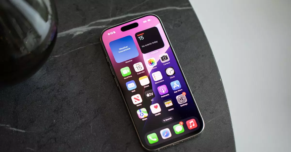
In a recent endeavor to reinvent my phone’s homescreen, I spent considerable time evaluating each app’s role and utility in my daily life. The realization hit me – functionality should dictate presence. Apps that I rarely open, like parking assist tools, seemed to monopolize space that could be more thoughtfully curated. This minimalist approach encourages a fluid use of technology, allowing essential apps and widgets to coexist harmoniously without the looming threat of digital noise.
The potential for transformation becomes apparent when individuals take cues from the Android ecosystem, where users have long enjoyed the flexibility of having an app drawer. Yet, iOS remains tethered to the idea that every app downloaded must appear on the homescreen—an idea that feels increasingly archaic. The updates rolled out in iOS 14 and 18 have begun to challenge this norm, but many users remain hesitant to depart from the iconic grid format.
What eventually won me over was a functional minimum—stripping my homescreen down to only essential applications and thoughtfully placed widgets. As I reimagined my digital landscape, I became more aware of the psychological benefits that come from a less cluttered visual space. No longer did I feel the incessant pressure of notifications vying for my immediate attention. Instead, the calm of an organized space fostered a more deliberate interaction with my device.
My process involved determining which apps were genuinely beneficial and regular parts of my routine. Apps that provided no consistent utility were either hidden in the app library or deleted altogether. The satisfaction of seeing just a few icons, juxtaposed with functional widgets, fostered a sense of clarity that I hadn’t previously felt while scrolling through endless rows of icons.
Preserving Notification Management
While the minimalist homescreen offered a refreshing reprieve, the absence of visible notification badges presented a new challenge. The inability to see alerts at a glance allowed some notifications to slip through the cracks. I am more adept at managing my alerts without succumbing to the compulsive need to eliminate red badges. However, the trade-off is worth considering. The reduced clutter and focus now allow me to manage my time on the device without the anxiety of missing something important hovering in front of me.
Furthermore, this approach allows for a tailored experience that can easily adjust as my needs change. During intense periods—such as road trips or upcoming events—temporary adjustments can be made, such as adding relevant apps back to the homescreen and swiftly removing them afterward.
Collaborating with others in the tech community has unveiled a wealth of creative ways to maximize home screen efficiency. For example, colleagues have adopted various strategies ranging from extreme minimalism that favors predominant widget use to curated sets of apps specifically tailored for particular tasks or routines. These personal choices unite around a central theme: a desire to reduce inefficiency and distraction from their phones.
One colleague articulated a philosophy where sensory overload from visual stimuli is reduced through custom shortcuts tailored to specific functions, rather than app icons that may become distractions in their own right. Everyone’s journey toward achieving a better digital workspace embodies a departure from conventional setups in favor of personalization.
Ultimately, the evolution of smartphone interfaces prompts users to consider how best to engage with technology. Many of us have come to appreciate predictive features like Siri’s suggested apps, which reduce the friction of finding tools quickly. These developments signal a move toward a future where AI can become an integral part of organizing our digital lives. However, navigating these changes doesn’t require waiting for advanced technology or complicated setups.
So, as we reflect on our digital interactions, let’s remember that the power to redefine our smartphone experience relies on our willingness to adapt and innovate. An oasis of organization awaits, and the journey begins with our individual choices to prioritize usability over visual chaos.